
BRANDING AND PACKAGING
I was hired for a freelancing job to design the branding and labels for the relaunch of the Lavender Boutique Aromatherapy products.
This was quite an exciting client of mine as Lavender Boutique is locally owned and operated, with the owner growing the lavender herself out in Masterton and selling aromatherapy products made out of that very lavender she grows. I absolutely love lavender - so working for a local New Zealand, female owned business that is entirely centered around the plant was such an exciting and fun opportunity!
The client approached me, telling me that she loved the script typography that I do on social media, and that she really want that to be included into the logo somehow.

For the logo we agreed that the name of the brand needed to have the script typographical design, and the client loved a soft circular shape to it. We also decided that purple had to be in there somewhere and that there needed to be a hint of the lavender plant in the design too.
All of these specifications together meant that the logo concepts I presented were quite similar in style, but I played around with how those specifications were actually applied.
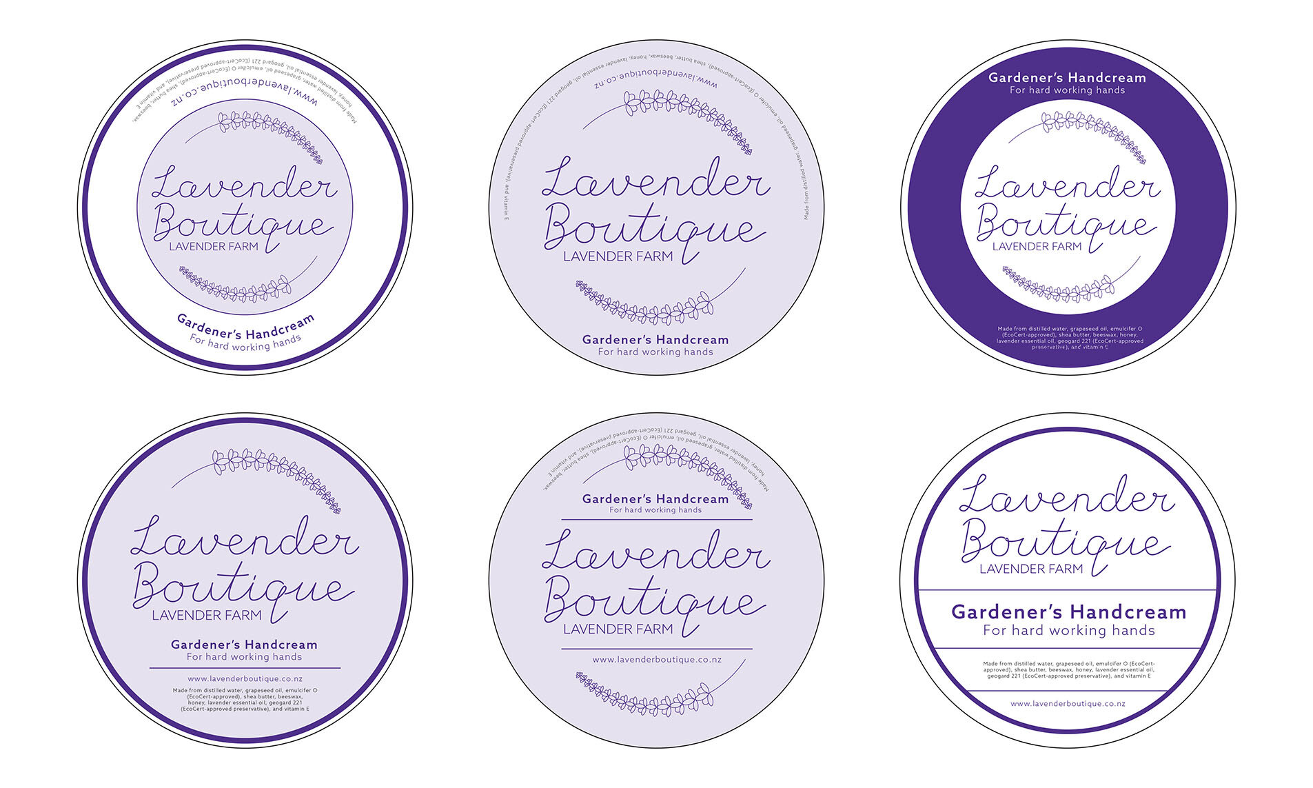
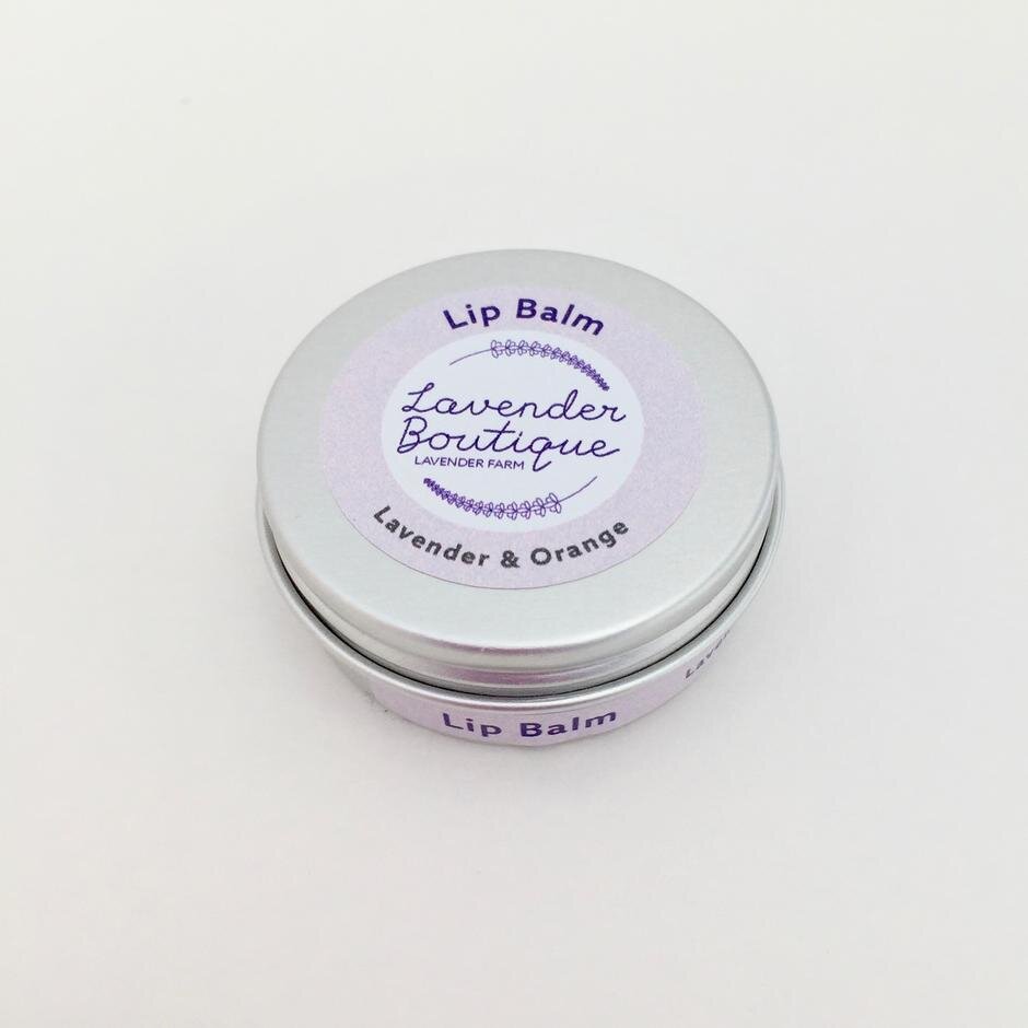
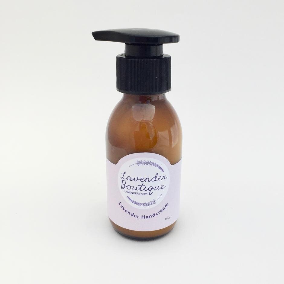
For the labels of the products, we decided to go minimal with the design as the packaging was very small so we did not have a lot of real estate with the layout.
The focus for the labels were to be the logo, followed by the ingredient list as the client is quite proud of the small number of ingredients in her products.
“I think the circular logo with scripty writing and incorporating drawing of lavender will work well. I especially liked the lavender illustration, the simplicity and clarity of skin theory label - I understand that we are not making decisions at this time but are exploring ideas and options. I liked the colour ways.”
– Client feedback after receiving the moodboard

We decided to go quite simple with the logo design, the focus was to be on the name of the brand and to make the script typography very legible as it will be scaled down very small in some cases.
“I’m grateful that I’ve got an experienced graphic designer on the job. I hope your day is going well :)”
– Feedback from client as we developed the concept designs
Like any branding project, a variety of versions were produced – as well as digital and print options, there were greyscale, a full design, a slightly stripped back design, and a very stripped back design. We also produced an inverted colour version, which can be used in situations such as adding on top of very detailed photographs.
We also produced versions of the logo with the word “Aromatherapy” in place of “Lavender Farm” as the client wasn’t 100% sure whether to have a sub-brand from her farm for the products or to keep them together. In the end she kept them under the same brand, but was appreciative of the options available both pre-launch and in the future.
Having all of these meant the client was able to apply them where necessary on her other outputs, such as her website and social media.
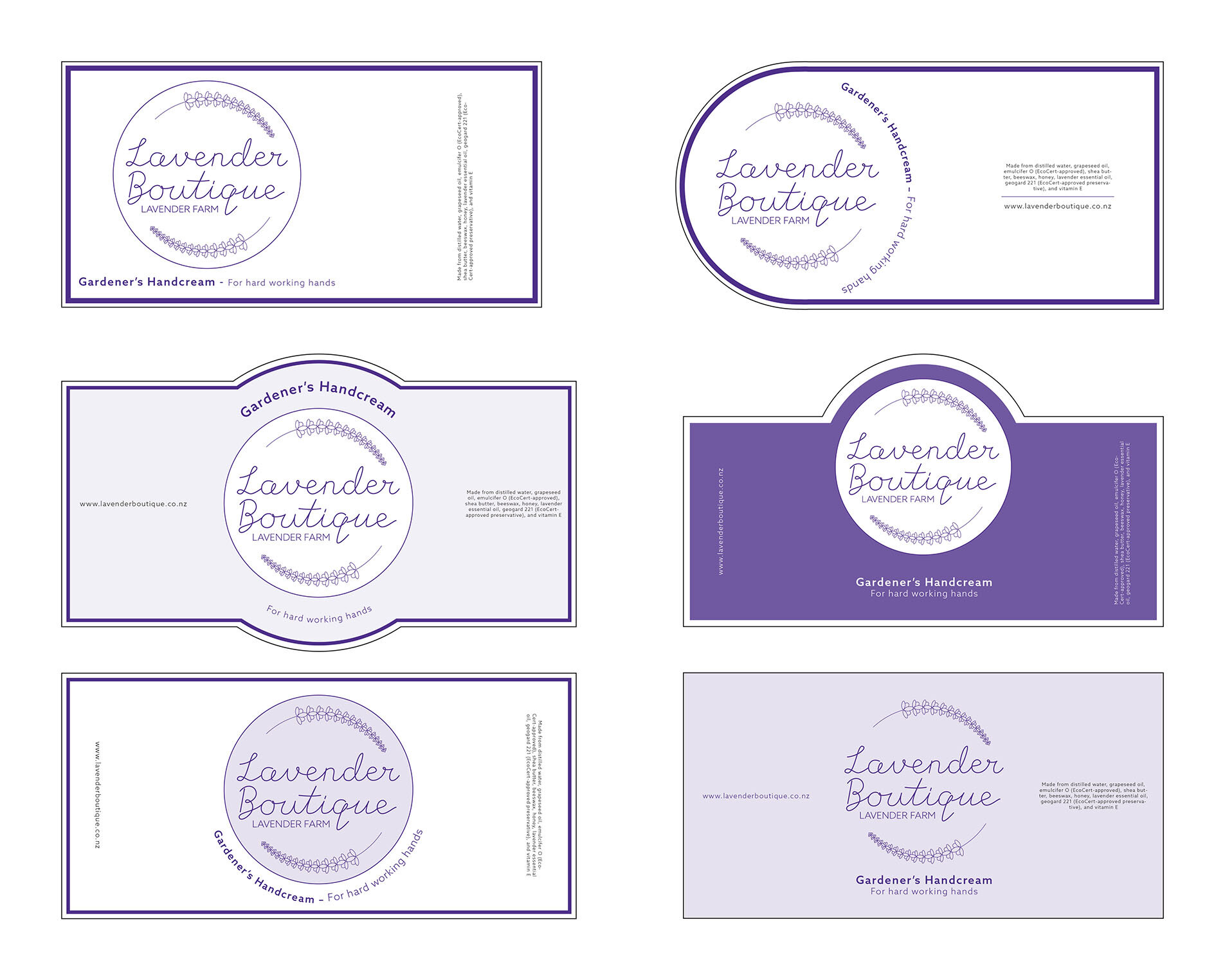
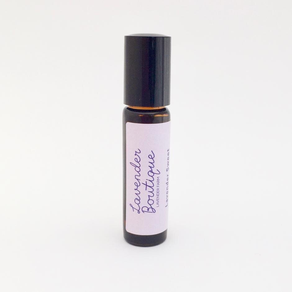
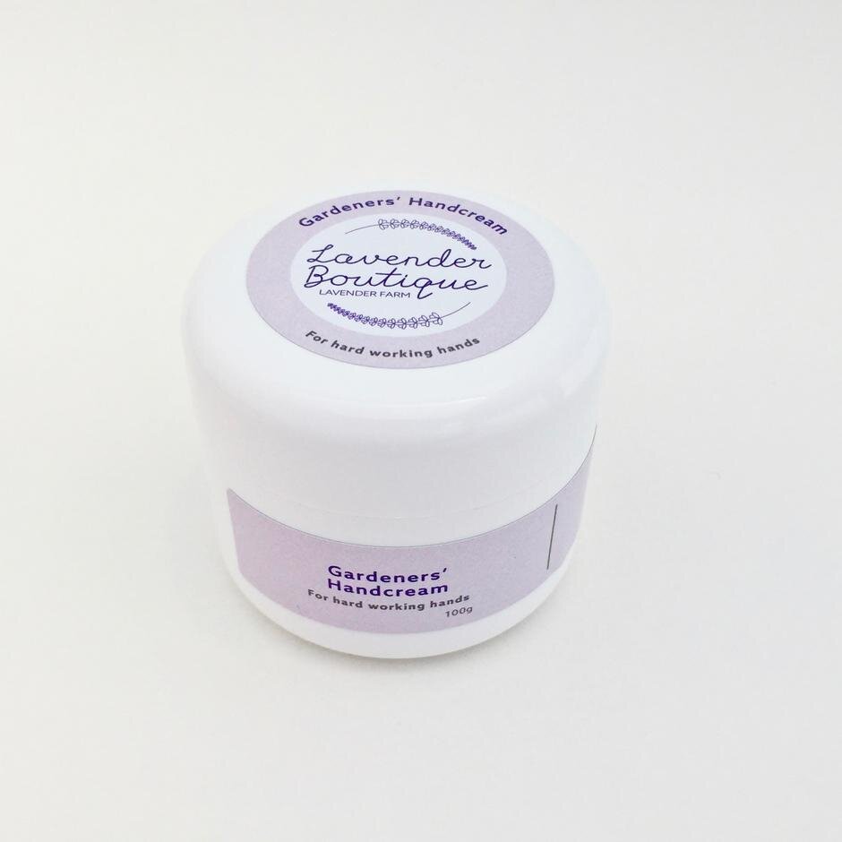
For the labels, there were two different shapes to design for as there were two packaging shapes – a short pot, and tall bottles. We wanted both label shapes to be cohesive (as well as cohesive to the logo!) as well as fitting the size of the bottle. As discussed at the beginning, the packaging were quite small - ranging from 10ml essential oil bottles, to 100g lotion pump bottles and 10ml lip balm pots.
We wanted to retain the circular shape from the logo where we could, so when the size of the label allowed it, we included a bold circle design.
“It was good to meet up with you again and I appreciate your calm, ordered way of doing things as well as your design talents. Thanks very much for sending through the latest designs. I like your solution for the round labels.”
– Feedback from client as we developed the labels

Both myself and my client were very happy with how the products worked out. The labels looked wonderful printed and on their containers, and the logo fits in perfectly across their digital channels.
“I picked up the proofs yesterday morning. Thank you for all your hard work! Thanks very much for the huge effort that has gone into getting the labels just right!!!!”